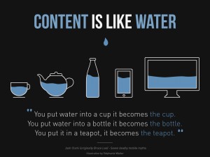
 Responsive web design (RWD) is an approach to web design aimed at crafting sites to provide an optimal viewing and interaction experience—easy reading and navigation with a minimum of resizing, panning, and scrolling—across a wide range of devices (from desktop computer monitors to mobile phones).
A site designed with RWD adapts the layout to the viewing environment by using fluid, proportion-based grids, flexible images, and CSS3 media queries, an extension of the @media rule, in the following ways:
- The fluid grid concept calls for page element sizing to be in relative units like percentages, rather than absolute units like pixels or points.
- Flexible images are also sized in relative units, so as to prevent them from displaying outside their containing element.
- Media queries allow the page to use different CSS style rules based on characteristics of the device the site is being displayed on, most commonly the width of the browser.
Responsive web design is becoming more important as the amount of mobile traffic now accounts for more than half of total internet traffic. This trend is so prevalent that Google has begun to boost the ratings of sites that are mobile friendly if the search was made from a mobile device. This has the net effect of penalizing sites that are not mobile friendly.
History
The first site to feature a layout that adapts to browser viewport width was Audi.com launched in late 2001, created by a team at razorfish. Limited browser capabilities meant that for Internet Explorer, the layout could adapt dynamically in the browser whereas for Netscape, the page had to be reloaded from the server when resized.
By 2008, a number of related terms such as “flexible”, “liquid”, “fluid”, and “elastic” were being used to describe layouts. CSS3 media queries were almost ready for prime time in late 2008/early 2009. Ethan Marcotte coined the term responsive web design (RWD)—and defined it to mean fluid grid/ flexible images/ media queries—in a May 2010 article in A List Apart. He described the theory and practice of responsive web design in his brief 2011 book titled Responsive Web Design. Responsive design was listed as #2 in Top Web Design Trends for 2012 by .net magazine after progressive enhancement at #1.
Mashable called 2013 the Year of Responsive Web Design. Many other sources have recommended responsive design as a cost-effective alternative to mobile applications.
Although many publishers are starting to implement responsive designs, one ongoing challenge for RWD is that some banner advertisements and videos are not fluid. However, search advertising and (banner) display advertising support specific device platform targeting and different advertisement size formats for desktop, smartphone, and basic mobile devices. Different landing page URLs can be used for different platforms, or Ajax can be used to display different advertisement variants on a page. CSS tables permit hybrid fixed+fluid layouts.

